Task-first entry
People often know they need help before they know how to describe the problem.
01 / Project
AI-assisted decision-support experience
Helps people navigate unfamiliar systems by turning confusing messages and information into clear next-step decisions.
Research, problem reframing, information architecture, follow-up logic, Verdict / Reason / Action, prototyping, and validation.
Figma for interface prototypes; card sorting for information architecture; Wizard of Oz sessions and prototype tests to evaluate the decision flow.
Interaction prototype with simulated guidance; no production AI or live API.
01 / Problem
The problem was not translation. It was decision effort.
People can receive a bank notice, form prompt, or unfamiliar instruction and understand the words while still being unable to answer three practical questions: Does this apply to me? Is action required? What should I do next?
ClearStep reframed the task from translation toward helping people move from uncertain information to a clear next-step decision.
02 / Insight
Research goal: Understand how people group everyday tasks and whether structured guidance helps them decide what to do next.
The archived validation records that users valued a clear action more than additional explanation. ClearStep is structured as an action-first decision-support experience.
03 / Scope
Identify important information and what it means for the immediate task.
Request one focused detail rather than guessing through uncertainty.
No replacement of user judgment, risky task execution, or removal of user control.
04 / Solution
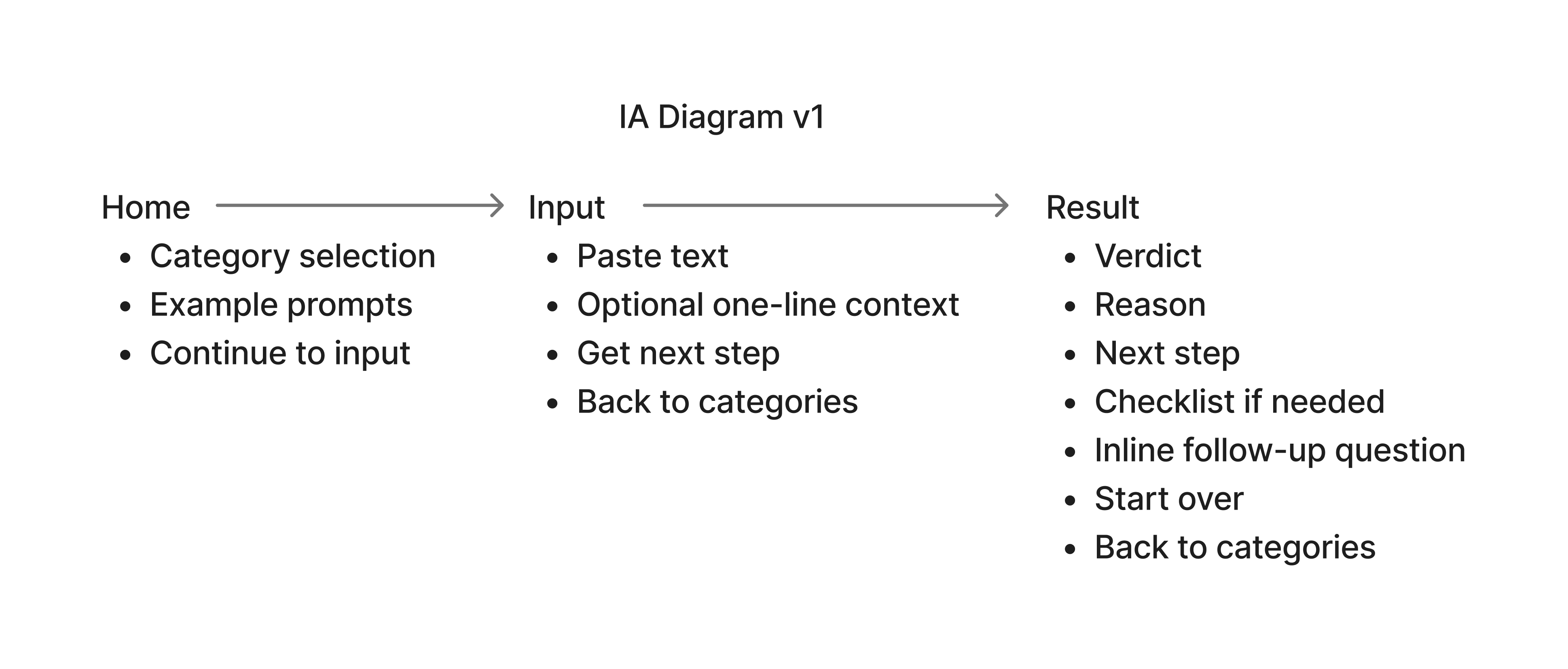
The experience begins with the task, not a blank AI prompt. The system uses provided information, asks for one missing detail only when necessary, and returns guidance in a stable structure.
05 / Key decisions
People often know they need help before they know how to describe the problem.
When an important fact is missing, the system asks instead of manufacturing certainty.
Judgment, explanation, and next step stay separate and easy to scan.
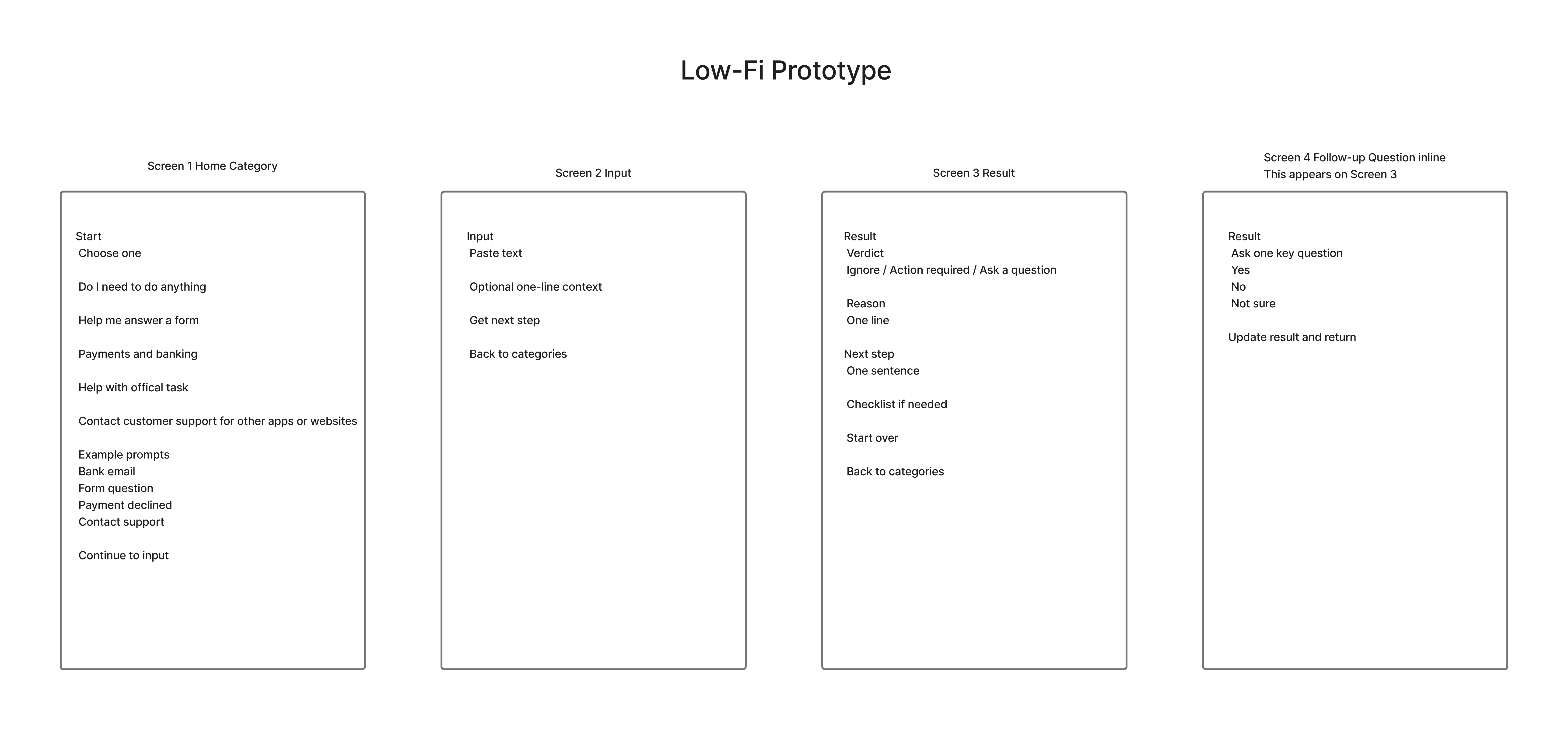
Test labels, task flow, and result structure with manually generated responses.
Refine task labels and privacy guidance while keeping Home → Input → Result shallow.
Add explicit option selection and confirmation, expandable result details, and recovery paths.
06 / Testing
The most important result was behavioral: users could identify whether action was required and what to do next with more confidence.
Interviews, card sorting, information-architecture evaluation, Wizard of Oz validation, and prototype testing were used at different stages. The work was not a single visual pass: labels, privacy guidance, and follow-up behavior were evaluated and revised while the core workflow remained stable.
| Finding | Response |
|---|---|
| Users hesitated at categories without concrete examples. | Added examples beneath category labels. |
| Privacy warnings needed more concrete guidance. | Added sensitive-detail highlighting. |
| Selecting an option and confirming felt safer. | Kept the selection + Next confirmation. |
Before and after structured guidance.
Task responses rated 5/5 for confidence, before and after guidance.
Users preferred a next step over extra explanation.
07 / Outcome
I owned the research, problem framing, product strategy, information architecture, interaction design, AI behavior, prototyping, testing, iteration, and final communication.
The completed work includes an interaction prototype and documented validation.